Civi - Responsive Online CV Template
 2.5
2.5
Responsive Online CV
HTML Template
2.5
Responsive Online CV
HTML Template

Lorem ipsum dolor sit amet, consectetur adipiscing elit. Integer posuere erat a ante.
Lorem ipsum dolor sit amet, consectetur adipiscing elit. Integer posuere erat a ante.
| # | Table Head | Table Head | Table Head |
|---|---|---|---|
| 1 | Table Content | Table Content | Table Content |
| 2 | Table Content | Table Content | Table Content |
| 3 | Table Content | Table Content | Table Content |
| # | Table Head | Table Head | Table Head |
|---|---|---|---|
| 1 | Table Content | Table Content | Table Content |
| 2 | Table Content | Table Content | Table Content |
| 3 | Table Content | Table Content | Table Content |
This is a simple hero unit, a simple jumbotron-style component for calling extra attention to featured content or information.


Hero figure image, as you seen on very top page section, uses two different images as source for responsive-friendly purpose.
Screen width => 992px
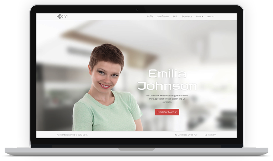
Screen width < 992px

On => 992px screen width, the image directly defined by <img> element. Find these lines in index.html.
<!-- Hero Image -->
<figure class="hero-figure">
  <img src="path-to-your-image-source.file" alt=""><!-- Replace the image here -->
</figure>
While on < 992px, the image defined by .hero-figure background-image property. Modify or override it in style.css.
.hero-figure {
  background-image: url(path-to-your-image-source.file); /* It's recommended to use 300 x 300 image dimension */
}
To change the background, edit #hero background-image property in style.css.
#hero {
  background-image: url(path-to-your-image-source.file); /* Set background image */
}
To generate skill chart, see markup below. Define the value/percentage of chart in data-percent.
<div class="chart" data-percent="68"><span class="percent"></span></div>
Below is the structure of timeline feature. It is recommended to follow this default structure because the elements and classes are depend each other.
<ul class="timeline">
  <li class="year top"> <!-- Year box, add class '.top' for the top year box only -->
    <span>The Year</span>
  </li>

  <li> <!-- Left floated timeline box -->
    <div class="tl-header">
      <h3 class="tl-role">Your Role</h3>
      <h4 class="tl-company">Institution</h4>
      <span class="tl-time">Span of time</span>
    </div>

    <p class="tl-content">Content here...</p>

    <img class="tl-img" src="img/thumb/thumb-3.jpg" alt="">
  </li>

  <li class="right present"> <!-- Right floated timeline box, add class '.right'. Add class '.present' to dot marker alternative -->
    <div class="tl-header">
      <h3 class="tl-role">Your Role</h3>
      <h4 class="tl-company">Institution</h4>
      <span class="tl-time">Span of time</span>
    </div>

    <p class="tl-content">Content here...</p>

    <img class="tl-img" src="img/thumb/thumb-3.jpg" alt="">
  </li>

  <li class="year"> <!-- Next year box -->
    <span>The Year</span>
  </li>
</ul>
If by some cases you find the timeline box overlapping, just add class .break to the <li> element of the overlapping box.
<li class="present break"> <!-- Add .break class to fix overlapping box -->
  <div class="tl-header">
    <h3 class="tl-role">Your Role</h3>
    <h4 class="tl-company">Institution</h4>
    <span class="tl-time">Span of time</span>
  </div>

  <p class="tl-content">Content here...</p>

  <img class="tl-img" src="img/thumb/thumb-3.jpg" alt="">
</li>
Gallery image filter feature uses filter plugin and lightbox presentation concept. What you need to do is specify the category in data-group attribute .filter control toggle then place the categories in each of gallery items data-groups. See mark-up below:
<!-- Filter Control, define filter category in each control toggle 'data-group' attribute -->
<div class="gallery-control">
  <ul class="list-inline list-unstyled">
    <li class="filter" data-group="all"><span>All</span></li>
    <li class="filter" data-group="design"><span>Design</span></li>
    <li class="filter" data-group="web"><span>Web</span></li>
    <li class="filter" data-group="flash"><span>Flash</span></li>
  </ul>
</div>

<!-- The Gallery, a set of images -->
<div id="grid" class="row gallery-wrap">

  <!-- Here in each gallery item, specify the categories in 'data-groups' attribute which will filter the items based on 'data-group' filter control toggle.
  It's important to keep mark-up structure like this, otherwise it will generates unexpected result. -->

  <!-- Gallery Item -->
  <div class="col-md-4 col-sm-6 col-xs-12 gallery-item" data-groups='["all", "design"]'>
    <div class="gallery-frame">
      <a class="image-link" href="img/gallery/gal-img-1.jpg"><img src="img/gallery/gal-img-1.jpg" alt=""></a>
    </div>
  </div>

  <!-- Gallery Item -->
  <div class="col-md-4 col-sm-6 col-xs-12 gallery-item" data-groups='["all", "design", "web", "flash"]'>
    <div class="gallery-frame">
      <a class="image-link" href="img/gallery/gal-img-2.jpg"><img src="img/gallery/gal-img-2.jpg" alt=""></a>
    </div>
  </div>

</div>
Contact form uses built in php mail() function, so make sure the function is available and active. Open includes/mail.php then change the variables to suit your need.
define("RECIPIENT_NAME", "Your Name"); // Specify the receiver name
define("RECIPIENT_EMAIL", "youremail@domain.com"); // Specify the receiver email
define("EMAIL_SUBJECT", "Visitor Message"); // Specify the subject of message
To generate map properly, keep the mark-up structure and specify all the data- attributes value.
<div class="map-wrap">
  <div id="map" data-map-lat="48.856614" data-map-lng="2.352222" data-map-mark="Suite 9/13 South Mahana Montebello 1236 WA"></div>
</div>

<!-- Note:
  data-map-lat  -> Latitude value
  data-map-lng  -> Longitude value
  data-map-mark -> Info window content, popup when map marker clicked
-->
Perform smooth scrolling to the anchor in same page. Simply, add class .smooth-scroll to an <a> element. You can also specify top offset value in data-scroll-offset.
<a href="#destination" class="smooth-scroll" data-scroll-offset="60"> ... </a> <!-- Smooth scrolling to 'id=destination' with top offset 60px -->
Generate image lightbox popup by simply add .image-link class to an <a> element directed to image link.
<a class="image-link" href="img/gallery/gal-img-1.jpg"><img src="img/gallery/gal-img-1.jpg" alt=""></a>
Bootstrap has its Responsive Embed feature to make media content goes responsive. Alternatively you can also use this template responsive video feature which only work for video.
<div class="video-wrap">
  <iframe src="//player.vimeo.com/video/88131286" width="500" height="281" frameborder="0" webkitallowfullscreen mozallowfullscreen allowfullscreen></iframe>
</div>
The twitter feeds widget implementation is generated by Jason Mayes's Twitter Fetcher script. To use, you have to firstly get your own widget id that can be found in twitter widgets page. Check the widget creation url and find the line like this data-widget-id="393276115713654784. The numbers is your id.
After you get the id, place it on template's data-widget-id then specify the value of data-length to display the numbers of tweets that you want returned. The value must be between 1 to 20.
<div id="twitter-widget" class="twitter-widget" data-widget-id="347099293930377217" data-widget-length="3"></div>
Any third-party assets used in this template is copyrighted to respective owners and it comes under their license.
Bootstrap 3.3.4 - http://getbootstrap.com/ - MIT License (MIT)
jQuery 1.11.2 - http://jquery.com/ - MIT License (MIT)
jQuery ScrollTo 1.4.14 - http://flesler.com/jquery/scrollTo/ - MIT License (MIT)
Magnific Popup 1.0.0 - http://dimsemenov.com/plugins/magnific-popup/ - MIT License (MIT)
Easy Pie Chart 2.1.6 - http://rendro.github.io/easy-pie-chart/ - MIT License (MIT)
Shuffle 3.0.4 - http://vestride.github.io/Shuffle/ - MIT License (MIT)
FitVids 1.1.0 - http://fitvidsjs.com/ - WTFPL license
Twitter Fetcher 13.0 - http://jasonmayes.com/projects/twitterApi/ - Free to use
Parsley 2.0.7 - http://parsleyjs.org/ - MIT License (MIT)
Gmaps 0.4.17 - https://hpneo.github.io/gmaps/ - MIT License (MIT)
HTML5 Shiv 3.7.2 - https://github.com/aFarkas/html5shiv - MIT License (MIT) / GPL version 2
Respond 1.4.2 - https://github.com/scottjehl/Respond - MIT License (MIT)
Font Awesome 4.3.0 - http://fortawesome.github.io/Font-Awesome/ - MIT License (MIT) / SIL OFL 1.1
Google Font Revalia - http://www.google.com/fonts/specimen/Revalia - SIL OFL 1.1
Google Font Droid Sans - http://www.google.com/fonts/specimen/Droid+Sans - Apache License, version 2.0
Google Font Lato - http://www.google.com/fonts/specimen/Lato - SIL OFL 1.1
Images - http://pixabay.com/en/ - Creative Commons Deed CC0
I give my full support to this template. If you find problem or have any questions, feel free to contact me by my personal email hendri.juhanda@gmail.com.